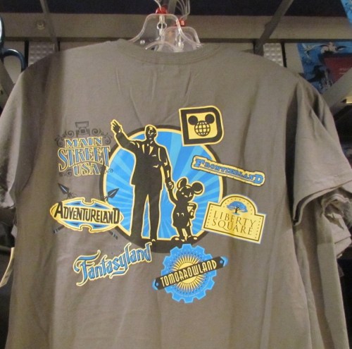
Sometimes the merchandise Disney creates is a home run and it flies off the shelf as fast as Disney can stock it and sometimes it just fails to move. Take a look at this recently released collection of Magic Kingdom souvenirs and tell me which category you think it belongs in.
Head below the jump for my thoughts and a closer look at some of the souvenirs.
My first reaction when I saw this collection of merchandise was favorable. It’s great to see the Magic Kingdom get some iconic merchandise. It wasn’t retro, but it reminded me of some of the classic merchandise you could get in the 70s and 80s at Disneyland and Walt Disney World. Back then they came up with icons for each land and had unique merchandise you could take home with you that would remind you of your trip for years.
But after working on this story, I can see what’s wrong. Not only is the blue, white, and grey color scheme out of the main stream of today’s design palettes, but the combination of characters is unusual too. The cast members I spoke to said it wasn’t moving at all.
When I first saw it, only a few pieces were available in the Magic Kingdom, but I later saw the whole collection out at Mickey’s Gift Station in the TTC. I suspect it will soon only be available at Circle D, the cast member only shopping center backstage.
What do you think? Would you buy any of this merchandise at Disney?


I love the retro look of the print! I
Love the old school
Looking disney t shirts. However the great colour of the men’s Tshirt is so boring! What a dull colour. The mug looks cute!
The “new” Disnsey shirts online in blue, grey and yellow are awful….not colorful and bright…the shirts are not “happy”…I would never buy them…and i buy a lot of shirts when we are there since it makes me happy to wear Dinsey things….and yes, I am “Oldish” at 66……
Too busy for my tastes.
I don’t like it. It is too crowded and busy. If I stop and ponder over a design that long to see what is in it, I’m moving on. Plus, Stitch needs to be removed, or at least taken out of the main spot. He should never be larger than Walt and Mickey!
Interesting designs.
You’re right about the blue/white/grey color scheme, that falls between a fail and just plain boring.
I personally tho think that-that second blue shirt with Ariel factoring prominently is a winner. Cool shirt.
The other designs ARE certainly busy, and i can’t tell if I like them or not. SEF is 100% right about Stitch being too big, and I wouldn’t mind a few of the characters on there being switched for better/more notable ones at the park. But for what it is, I sort of like it in a weird way.
Kind of feel like I need to buy one, just for when they do “not sell”, I will have the most unique Disney shirt in the park, lol :)
Comments are closed.